RICARDO BÁEZ
Archivo Gráfico™ Venezuela
When the mind proliferates images of accord, and designers form the enunciabilities of a nation, the archive is burnished to a dimension bound in static proportion. The velocity and range of a country’s aesthetic regime is articulated in the power of graphic form, surpassing solely the built, concentrated in the mobile projections – record covers, magazines, catalogues, books. Forging a timeline vulnerable to erosion, Venezuelan graphic designer Ricardo Báez formatted a potent repository, Archivo Gráfico™ Venezuela, enabling introspection into types of corporate sponsorship routinely tied to oil extraction, such as El Farol magazine, “where Venezuelans themselves got to know their country through the eyes of a US oil company, Creole”. Pulsating forward new perceptions of modernity, these graphic articles were clearly defined by the engines of industry. Climaxes of identity were situated as masks across frontiers, “demonstrating that design is an autonomous language that defines a way of thinking in Venezuela, something that the Chavista revolution has sought to erase” – surrendering posthumously a compass of Caracas’ enduring voice.
The following interview has been edited for length and translated from the original Spanish into English.
(1)

(2)
(3)
Describe your foundational archive in one sentence.
Archivo Gráfico™ Venezuela is an incomplete and constantly expanding digital archive that contemplates the production of Venezuelan Graphic Design between the years 1950–2000.
How do you view the act of archiving itself, and how do you forge new territories of implementation from these references (with students, collectives, etc, even within your own practice?)
In Venezuela, memory (cultural, political, social, educational) has been systematically erased over the last twenty years, it's important for an individual or a collective to decide to archive (whatever that may be) to leave a memory of what some wish to keep secret. To know about our past to understand what to do in the present and the future, both the mistakes and the successes. For me personally, as an actively producing graphic designer, reviewing the entire past of Venezuelan graphic design has been more valuable than even having studied academically at a design school. Analyzing design pieces and critically reviewing design decisions made in a specific context can be a tremendous aid to personal and collective development.
What was the initial vision and impetus for recovering, selecting, and presenting these archives?
When I began studying design (PRODISEÑO School of Design, Caracas, Venezuela, 2002), I was instilled with an interest in the history of Venezuelan design, not only to study its "history," but to understand the importance and power of graphic design in Venezuela, in relation to the region (Latin America) and the world. When I began collecting design pieces created here between the 1960s and 1980s, I was impressed by the immense quality of both the graphic design and the exhaustive graphic production they had (printing with special inks, experimental bindings, etc.). It was a pre-Internet era in the country, and there was very little access to global references, except through books and magazines. When I compared what I saw of universal graphic design with Venezuelan graphic design, I began to wonder why Venezuelan graphic design had not been included in the historical canon of graphic design. I tried many times to make connections or upload material to the internet through platforms like Flickr or Tumblr, but it was always very irregular. More than twenty years later, I decided to create Archivo Gráfico™ Venezuela, which draws mostly from my personal graphic design collection. I wanted to begin publicizing the high quality of Venezuelan graphic design, and thus—perhaps it's too utopian an idea—reach researchers so they would at least consider including Venezuela in the universal history of graphic design, given its uniqueness and high quality of execution (in every sense!).
On territory: with the weight of the archive centered on Caracas, were there also regional shifts throughout Venezuela on graphic design culture?
Graphic design (called Venezuelan, perhaps it should be called Caracas graphic design) was produced in Caracas but was distributed and exhibited throughout almost the entire country through specific design pieces, such as the magazine El Farol, which was distributed free of charge throughout the country, with approximately 40,000 copies per issue. It could be said that at the time that magazine was produced, there were almost as many magazines as there were people in the country. By distributing a quality design piece, people are nourished by that aesthetic, and that leads to developing design criteria—albeit unconscious—for everyday life. There are examples, such as regional museums, where design pieces were produced in Caracas, such as the Barquisimeto Museum (Lara state, Venezuela) or the Jesús Soto Museum of Modern Art (Ciudad Bolívar, Bolívar state). We could name many more examples, but there is a design effect produced in Caracas that spread to the rest of the country in multiple ways.

(4)
Continuities & Shifts
What does the visual culture of 1960–1990 tell us about Venezuela then — and now?
The visual culture from mid-20th-century Venezuela reveals much about the country then, and it also resonates today. At that time, Venezuela reached a remarkably high—arguably excessive—sociocultural and economic level within the region. As a result, many cultural expressions, especially graphic design, attained extraordinary quality and significance. It also reflects the Venezuela of today: when a political ideology seeks to erase traces of cultural evolution, it affects the nation as a whole. I'm referring to a very specific event that happened a few years ago, when a Minister of Culture requested that all emblems (all designed by Venezuelan design masters) of museums and public institutions associated with culture be replaced with a single indigenous symbol. Such an action, on the one hand, demonstrates great resentment toward the country's past, but it also demonstrates that design is an autonomous language that defines a way of thinking in Venezuela, something that the Chavista revolution has sought to erase. It's difficult for that to disappear. A large part of my interest in creating the Archivo Gráfico™ Venezuela is to counteract this systematic disappearance of what Venezuela was seventy years ago, at least from the perspective of graphic design and its cultural, political, and social consequences.
On geography: describe the influences, challenges, and pressures of design identity across Venezuela, Latin America, and the broader world in context to the period 1960-1990.
Venezuelan graphic design has its own identity, but it's always strongly influenced by European and North American design. From what I've spoken with some of the key figures of that era, I don't think there was any question about what constituted Latin American design or not, or whether there should be a brand that identified them as Latino. Perhaps some of the exponents of graphic design in Venezuela had that idea, but it wasn't the general idea.
What became a form of ‘vernacular’ and what was considered evolutionary, challenging and innovative?
The experimental and exhaustive use of typographic techniques in Venezuelan graphic design is the element that I find most characteristic, and we could say evolutionary and innovative, in its practice throughout the mid-20th century. Conceiving a design solution primarily from a typographic perspective is something that was widely practiced here, and obviously, it's an idea that's been practiced all over the world. Due to the frenetic production in cultural environments (between all museums and galleries, some 2,000 or 3,000 art catalogs have been produced in 50 years), we can see that all graphic and typographic design was pushed to the limits of ideas and techniques, too.

(5)
Arteries of Representation: Sponsorship, Content, Audience
Museums, petroleum companies, corporate foundations — how do you see these channels as representational arteries, extending beyond aesthetics into cultural ideology? To what extent can design be read as a form of cultural propaganda, and to what extent as autonomous invention?
Today, it can be said that Venezuelan graphic design of the last century existed primarily thanks to oil extraction. The largest percentage of the budget allocated to produce design pieces came from oil companies or government institutions, and public museums. It's clear that graphic design in Venezuela was the main communicative and expressive vehicle that helped promote ideological, political, and cultural thought, and the great example was always—once again—El Farol magazine, where Venezuelans themselves got to know their country through the eyes of a US oil company (Creole). I can't see Venezuelan graphic design as an autonomous invention because graphic design as an idea wasn't invented in Venezuela, but I do believe that a way of approaching design was created, a way of thinking autonomous from design was created.

(6)

(7)

(8)
Did graphic design in this period permeate in a way that today’s fragmented, digital publishing ecosystem cannot replicate?
Universal and local graphic design is what it is thanks to all the past it has lived through. I don't assume contemporary graphic design exists without all the design and visual arts movements we've been able to study so far. "The current fragmented digital publishing ecosystem," as you call it, should be fully utilized and brought to more relaxed environments like a book, so we can truly see through different eyes what's happening with creative human thought nowadays.
For the yet unreleased collections — what major shifts or ruptures become visible across three decades of output?
There are two important changes in graphic design, not just in Venezuela, but worldwide. First, is how technology is dominating aesthetics; we can clearly see this in how almost all images today look similar because they come from a "digital" aesthetic. We all design—whether we like it or not—with a computer, so that already makes us visually similar. And the second change is how each context defines the needs of graphic design, and that consequently also creates a specific visual quality. When designing, for example, in the face of a graphic design approach associated with "identity," local ingredients begin to be used. For example, using typefaces designed in Latin America is a position that didn't exist 15 years ago because there were no type foundries that allowed for a range of typefaces to be able to design openly with. So, even that minimal change leads to a different way of designing and how graphic design starts looking different and act different from the rest.

(10)
With Puntal, Fundación Polar invested in a magazine that was less about mass circulation and more about shaping intellectual currency. How do you see this shift from oil-funded, mass-distributed platforms like El Farol to highly curated, limited cultural magazines like Puntal? What did it say about sponsorship, audience, and the role of design in the 1990s?
El Farol and CaL magazines set a precedent in the design and editing of magazines that led to the emergence of many similar publications in later decades. One of those later examples is Puntal, published by the Polar Foundation, with a similar objective to El Farol, but without the obligation to show a Venezuela unfamiliar to Venezuelans, but rather to a more limited circle of readers, due to editorial decisions and, I assume, issues of reproduction costs. It wasn't the same Venezuela of 1950, and the Venezuelans of that time weren't the same.
Implementation & Form
The role of the cover as an autonomous statement (often divorced from interior content) – it is the cohesive visual landmark of the archive. Was it the intention to include only the covers?
For me, the most important thing for Archivo Gráfico™ Venezuela is to show the synthesis of quantity and quality at the same time. I'm interested in showing a fragment (a cover) of something more complex, and that is currently complemented by an image and a complete listing of each item. I've also forged an important partnership with an institution called the Laboratorio de Tipografía de Caracas –The Caracas Type Lab– (Lab.Tip.CCS), led by Álvaro Sotillo and Gabriela Fontanillas (who were my design masters during my training). This institution has created a digital library with more than 30 full publications reproduced in extremely high quality, essential for the study of Venezuelan graphic design. You can access them completely free of charge. My idea of quantity versus their idea of showing internal parts of the design pieces is a very good complement. I strongly believe in partnerships, in collective contributions, and little by little, I feel that the Archivo Gráfico™ Venezuela will grow based on these types of decisions.

(9)
<> Archivo Gráfico™ Venezuela is a digital archive–created by Ricardo Báez (AGI member since 2022)–aimed specifically at World Graphic Design enthusiasts and researchers, that seeks to encompass the most useful information to understand and draw lines of investigation on the history of Venezuelan Graphic Design. AGV is an incomplete and constantly expanding digital archive that contemplates the production of Venezuelan graphic design between the years 1950–2000 (in a first version), and 2001–Now (in an upcoming version).

(11)

(12)
image references
00
Coro, Entidad de Ahorro y Préstamo
Category: Catalogues
Design: Daniel González
Year: Circa 1970
Client: Entidad de Ahorro y Préstamo de Coro, Venezuela
Medium: Paper
Content Partner: Archivo LabTipCCS, Archivo Daniel González
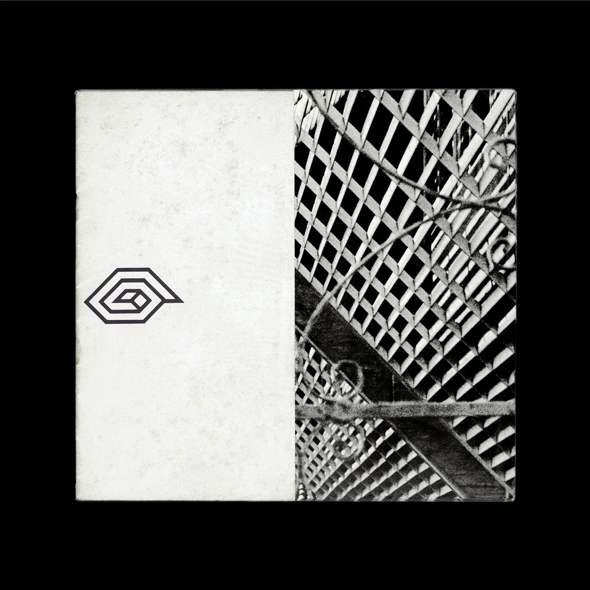
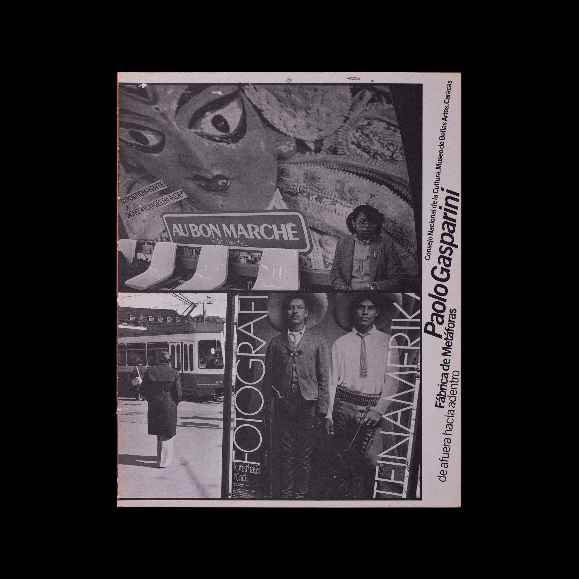
01
Fábrica de Metáforas. De afuera hacia adentro, Paolo Gasparini
Category: Catalogues
Design: Carlos E. Rodríguez, Ariel Pintos
Year: 1989 (Cat. #929)
Client: Museo de Bellas Artes de Caracas; Consejo Nacional de la Cultura
Medium: Paper
Size/Length: 226 × 286 × 5 mm / 40 pages
Content Partner: Archivo Ricardo Báez
Typesetting: Sarria. Printed in Caracas by Ex Libris.
02
Hombres de Carbón. Fotografías de Luis Lares
Category: Catalogues
Design: Ana Carolina Palmero
Year: 1993 (Cat. #899)
Client: Museo de Bellas Artes de Caracas; Gobernación del Estado Bolívar; Centro de las Artes de Ciudad Bolívar
Medium: Paper
Size/Length: 221 × 281 × 6 mm / 40 pages
Content Partner: Archivo Ricardo Báez
Typesetting: PrePrint. Printed in Caracas by Ex Libris. Copies: 1,500.
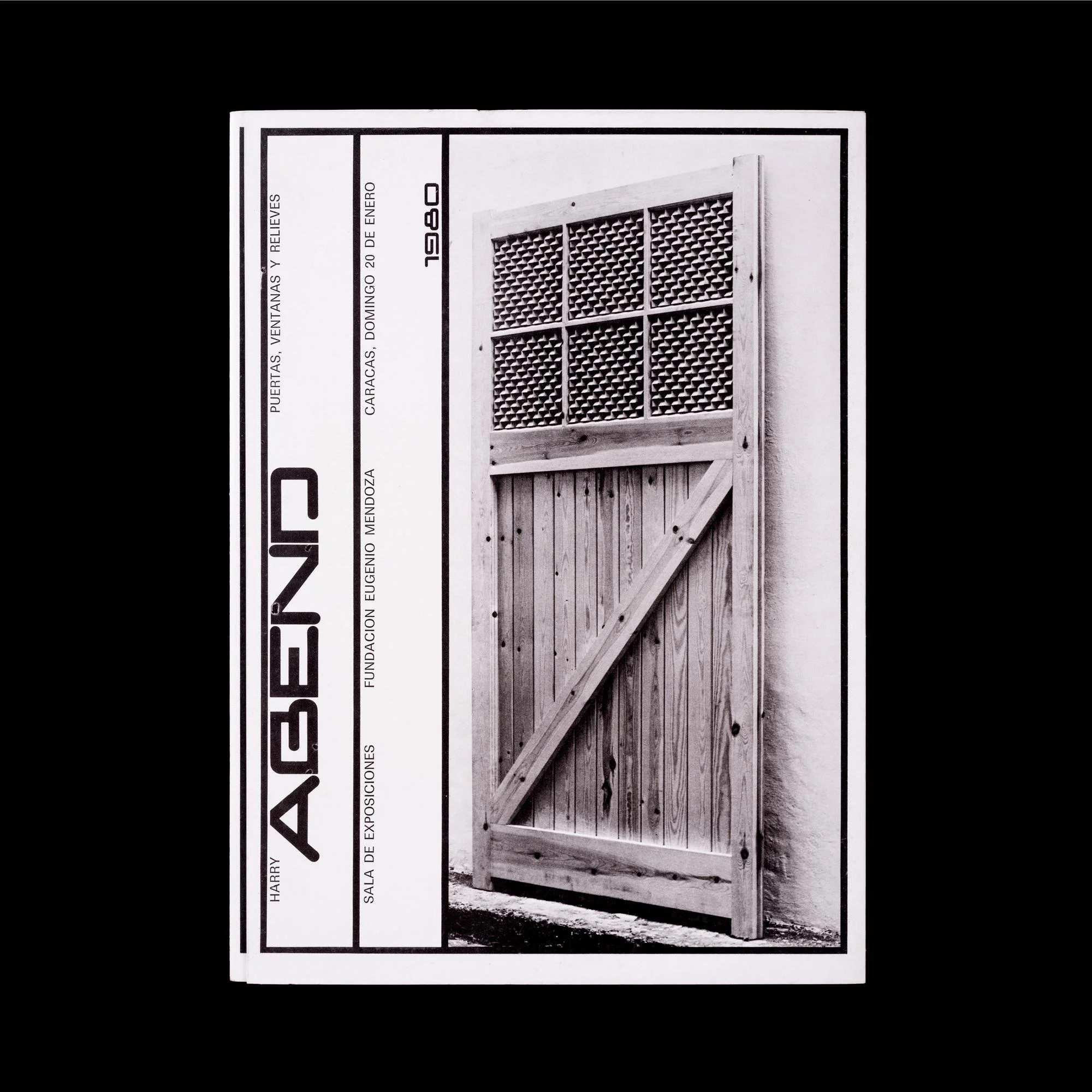
03
Harry Abend. Puertas, Ventanas y Relieves
Category: Catalogues
Design: Gerd Leufert
Year: 1980 (Cat. #844)
Client: Sala de Exposiciones Fundación Eugenio Mendoza
Medium: Paper
Size/Length: 210 × 276 mm / Triptych
Content Partner: Archivo Ricardo Báez
Printed in Caracas by Cromotip.
04
Imprimase #21
Category: Magazines
Design: Gerd Leufert, Nedo M.F. (Nedo Mion Ferrario)
Year: 1968 (February)
Client: Asociación de Industriales de Artes Gráficas, Caracas
Medium: Paper
Size/Length: 220 × 297 × 6 mm / 68 pages + inserts
Content Partner: Archivo Ricardo Báez
Printed in Venezuela by Cromotip.
05
El Farol #222
Category: Magazines
Design: Nedo M.F. (Nedo Mion Ferrario)
Year: 1967 (July–August–September)
Client: Creole Petroleum Corporation
Medium: Paper
Size/Length: 227 × 310 mm / 40 pages
Content Partner: Archivo Ricardo Báez
“El Farol” (“The Lantern”) magazine was published quarterly for free distribution in Venezuela. Edition of 38,000 copies. Printed in Venezuela by Cromotip. Clichés made by Fotograbado Vene. Art direction: Nedo M.F.
06
Sistema Nervioso
Category: Books
Design: John Lange
Typesetting: Baskerville
Photography: Barbara Brändli
Text: Román Chalbaud
Year: 1975
Client: Fundación Neumann; Corimon (Corporación Industrial Montana C.A.)
Medium: Paper, Beckett 100
Size/Length: 260 × 290 × 27 mm / 180 pages
Content + Institutional Partner: Colección C&FE®
Printed in Venezuela by Editorial Arte. Master printer: Javier Aizpurua.
07
Los Niños de Aquí, Thea Segall
Category: Books
Design: Álvaro Sotillo
Year: 1979
Client: Foto Ediciones; INTEVEP S.A., filial de Petróleos de Venezuela
Medium: Paper (Astralux 105 g/m², Beckett Tradicional 1848 148 g/m²)
Size/Length: 208 × 305 × 18 mm / 96 pages
Content Partner: Archivo LAB.TIP.CCS®, Caracas
Printed in Venezuela by Editorial Arte.
08
Fábrica de Metáforas. De afuera hacia adentro, Paolo Gasparini
Category: Catalogues
Design: Carlos E. Rodríguez, Ariel Pintos
Year: 1989 (Cat. #929)
Client: Museo de Bellas Artes de Caracas; Consejo Nacional de la Cultura
Medium: Paper
Size/Length: 226 × 286 × 5 mm / 40 pages
Content Partner: Archivo Ricardo Báez
Typesetting: Sarria. Printed in Caracas by Ex Libris.
09
El asiento de al lado. La Butaca Moderna
Category: Catalogues
Design: Ariel Pintos
Year: 1999
Client: Centro de Arte La Estancia, Caracas
Typesetting: Estancia & Floresta Book
Medium: Paper
Size/Length: 160 × 700 × 10 mm / 88 pages
Content Partner: Archivo Ricardo Báez
Printed in Caracas by Editorial Ex Libris.
10
Fábrica de Metáforas. De afuera hacia adentro, Paolo Gasparini
Category: Catalogues
Design: Carlos E. Rodríguez, Ariel Pintos
Year: 1989 (Cat. #929)
Client: Museo de Bellas Artes de Caracas; Consejo Nacional de la Cultura
Medium: Paper
Size/Length: 226 × 286 × 5 mm / 40 pages
Content Partner: Archivo Ricardo Báez
Typesetting: Sarria. Printed in Caracas by Ex Libris.
11
Puntal #6
Category: Magazines
Design: Pedro Mancilla, María Angélica Barreto
Year: 1996 (April, Year 4)
Client: Fundación Polar, Caracas
Medium: Paper
Size/Length: 219 × 310 × 2 mm / 28 pages + inserts
Content Partner: Archivo Ricardo Báez
Cover photography: Paolo Gasparini. Printed in Venezuela by Editorial Arte. 2,500 copies.
12
El Farol #211
Category: Magazines
Design: Nedo M.F. (Nedo Mion Ferrario)
Year: 1966 (January–February–March)
Client: Creole Petroleum Corporation
Medium: Paper
Size/Length: 227 × 310 mm / 48 pages
Content Partner: Archivo Ricardo Báez
“El Farol” (“The Lantern”) magazine was published quarterly for free distribution in Venezuela. Edition of 35,000 copies. Printed in Venezuela by Cromotip. Clichés made by Fotograbado Vene. Art direction: Nedo M.F.